Introduction to Network Analysis
Text Analysis Solutions
Last week, we explored how we could start to use text analysis to further uncover patterns and dynamics in the Index of DH Conferences dataset. While there are many directions to explore, I wanted to share some of the ways I approached the assignment.
First, I’m still interested in this question of DH tools and their popularity, but now with the full text I can start to explore how the tools are being discussed at these conferences.
Where we left off last week was trying to compare the combined abstracts of gephi, python, and voyant, and here’s our initial word cloud (or cirrus graph):
This initial graph we created was difficult to interpret since it seemed to predominantly highlight the most frequent words like and and the.
As I mentioned last week, these words are often called stopwords and are often removed from text analysis to better highlight the distinctive words in a text. We’ve come across a version of stopwords before in our discussions of AI training datasets, that often use standardized lists of ‘offensive’ words to remove from their training data.
In the documentation of Voyant, we can see that they actually have settings to activate stopwords.
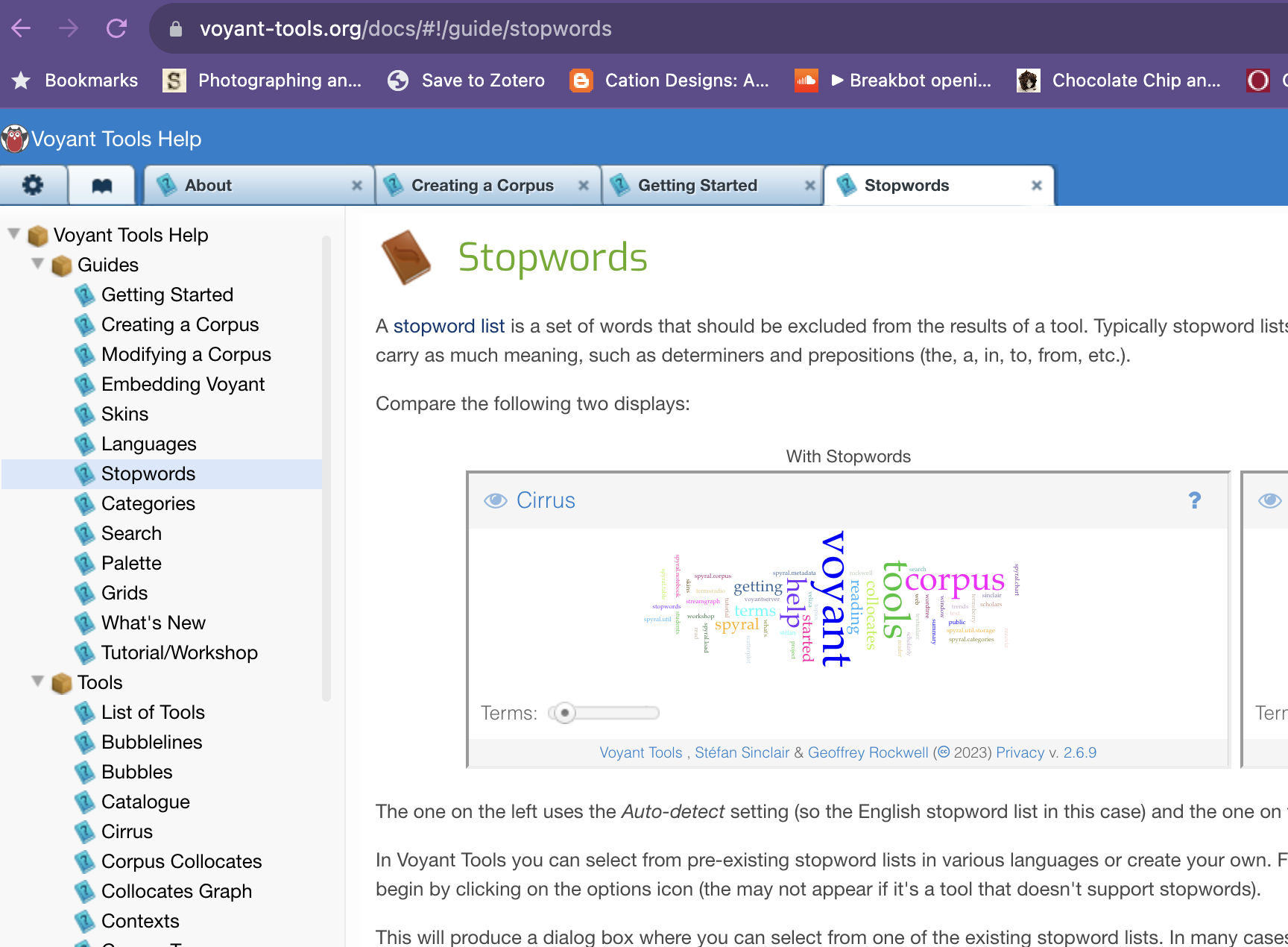
If we enable the stopwords setting for English, we get the following results:
We can now see much more conceptual words, though we are still getting a number of shorter words like der and die. These are German stopwords, which we could also try excluding (though Voyant would require us to add them manually).
Instead of doing that manually though, I decided to regenerate my text files to be language specific. This choice is a massive interpretative one that could skew my understanding of these topics, but by doing it for each language I can at least compare the results. Here’s the following counts for each language:
| languages | count | |
|---|---|---|
| 0 | English | 7852 |
| 1 | German | 814 |
| 2 | French | 85 |
| 3 | Spanish | 45 |
| 4 | Italian | 6 |
| 5 | Portuguese | 4 |
| 6 | English;French | 4 |
| 7 | English;French;German | 1 |
| 8 | English;French;Spanish | 1 |
I decided to focus on the top four languages, since the remainder are so small. I also decided to exclude the combined languages, since they are so few.
So now looking exclusively at the English language abstracts we get the following word cloud:
We can also see which words are most distinctive across our abstracts:
We can also look at what words correlate with our tools, like Voyant:
If we sort by correlation ascending, you’ll notice that the highest correlation is the word text, which means that frequently the two appear together. Conversely, we can see that the tool gephi is most frequently correlated with the word historical:
We can also do some topic modeling to see how discourses map across our abstracts. I set the number of topics to 13 since we have that many tools in our dataset. Here’s the results:
If we click on the topic that most correlates with Voyant, we see that it has the following terms:
humanities march http arguments 4humanities advocacy dh cultural fish society
While we need to dig in further to understand some of these terms, one thing that jumps is the term fish. In my opinion, this most likely refers to the literary critic Stanley Fish, who is a noted critic of the digital humanities. But again we would need to dig in further to understand the context of this term.
Finally, we can once again generate our links or network view:
In this network, I only selected the three tools python, gephi, and voyant. But we can include them all if we want:
Now we have a network graph that shows us the terms that most frequently connect our DH tools across these abstracts.
Unfortunately the Voyant Tools documentation does not include much about their links view, but if you hover over the ? you see the following explanation:
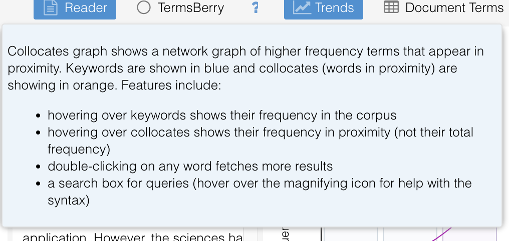
From this explanation, we can start to unpack how Voyant is creating this graph. Our tools are the keywords shown in blue and the orange terms are words that co-occur frequently. But to really understand what’s going on here, we need to start digging into network analysis.
Network Analysis
In class, we have been exploring how we can use text analysis to uncover patterns in our data. But we can also use network analysis to uncover patterns in our data.
What is a Network?
In The Network Turn, we learned that:
The network framework shapes how we interpret the world around us. Nothing is naturally a network; rather, networks are an abstraction into which we squeeze the world. Nevertheless, almost anything can be turned into a network, whether it be the interactions between characters in Shakespeare’s plays, the dissemination of memes on Facebook, or the trade network implicated in the ancient Roman brick industry.
But what is a network exactly?

In this figure from Chapter 3, we have a series of graphs. The first shows a bipartite graph connecting a group of texts to a group of miscellanies. You’ll notice in this graph we have circles with two colors and then links between them. In network analysis, we call these circles nodes and these links edges. In all networks, we have nodes and edges, but the type of nodes and edges can vary.
For example, in the second and third graph we have something called a projected graph. This is when you flatten the above graph to only show the connections between the nodes of the same color. So in this case, we have a graph of texts and miscellanies, but we only show the connections between texts and texts and miscellanies and miscellanies.
This example is very similar to what Voyant produces. So instead of showing us terms connected to our document, Voyant projects the graph to only show us the connections between terms.
So far we have been using tools that automatically create our network data, but in The Network Turn Chapter 5, the authors discuss taking correspondence letters and transforming them into networks, using the following information:
- John Smith wrote to Peter Jones three times: on 3 January 1596, 21 March 1596, and 12 December 1597.
- Peter Jones wrote to John Smith once: on 4 February 1596.
- John Smith wrote to Mary Smith twice: on 15 May 1596 and 25 July 1597.
The authors discuss how you can represent this data as networked data with the following figure:
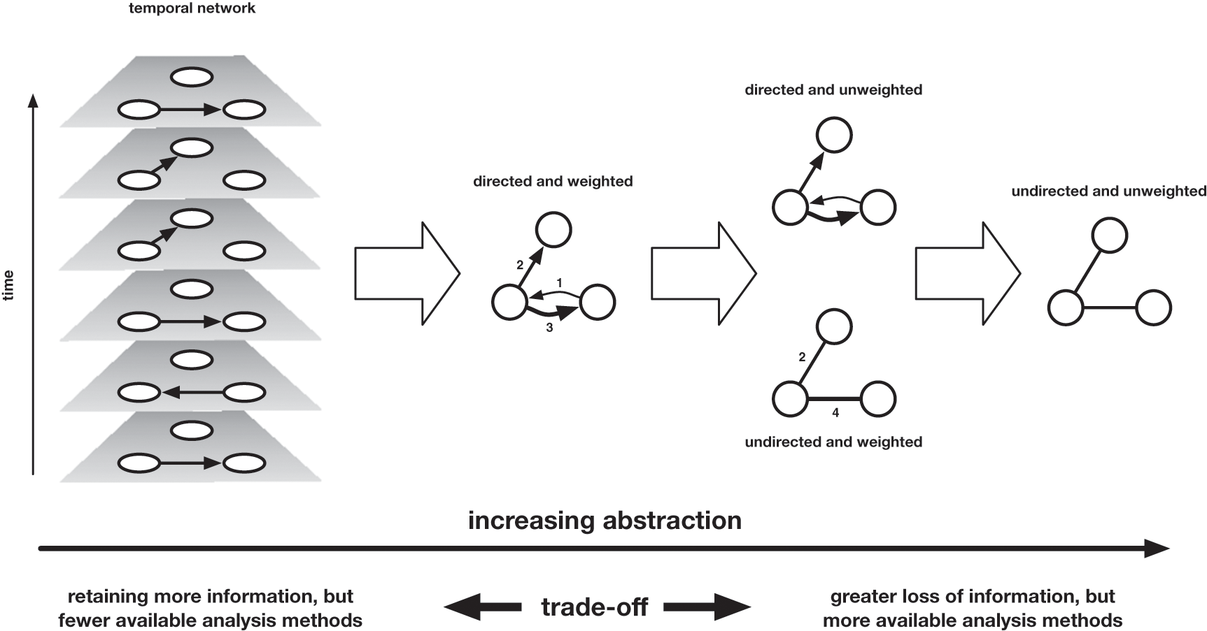
They discuss how if you assume that the individuals are nodes, then you have to decide what information to use to reprsent edges.
Moving from left to right, we move across a landscape of abstraction, which entails more information loss the further we travel. The rightmost representation of the network merely records the existence of an edge between these nodes, without any attention to the time at which these edges formed, the direction in which letters travelled (who was the sender, who the recipient), or the volume of correspondence that travelled along those edges. One step less abstract is the directed network, which records the direction in which letters travelled (but not the volume), and the weighted network, which encodes the volume of correspondence that marks those edges (but not the direction). One further step leftward is the weighted and directed network, which combines the two previous network attributes, Finally, the leftmost network is a temporal network, which records the direction and time of every item of correspondence separately.
While it might seem obvious to choose the network that most accurately represents these letters, the authors discuss how this version provides the least amount of algorithmic power. So when creating networks from cultural data we need to balance this question of accurately representing our materials with wanting to leverage the power of computation.
Creating Network Data
In the above example, we saw how we could create network data from correspondence letters. But how do we create network data from other types of cultural materials? And more fundamentally, what types of entities and relationships do we want to represent?
First, we need to figure out we create network datasets. Part of this determination depends on which tool you are using to work with your networks. But general most tools require you to create a node and edge list.
Some of the most popular tools in DH for this type of work are:
- Gephi: A tool for static network visualization that also allows you to calculate metrics and work with many different layouts.
- Palladio: A drag-and-drop tool for data management and dynamic network visualization.
And then I have also created a tool with my collaborator John R. Ladd:
- Network Navigator: A drag-and-drop web tool for network metrics and visualization.
We can also explore an example network dataset in this GitHub repository by Melanie Walsh that contains sample social network datasets https://github.com/melaniewalsh/sample-social-network-datasets/blob/master/sample-datasets/.
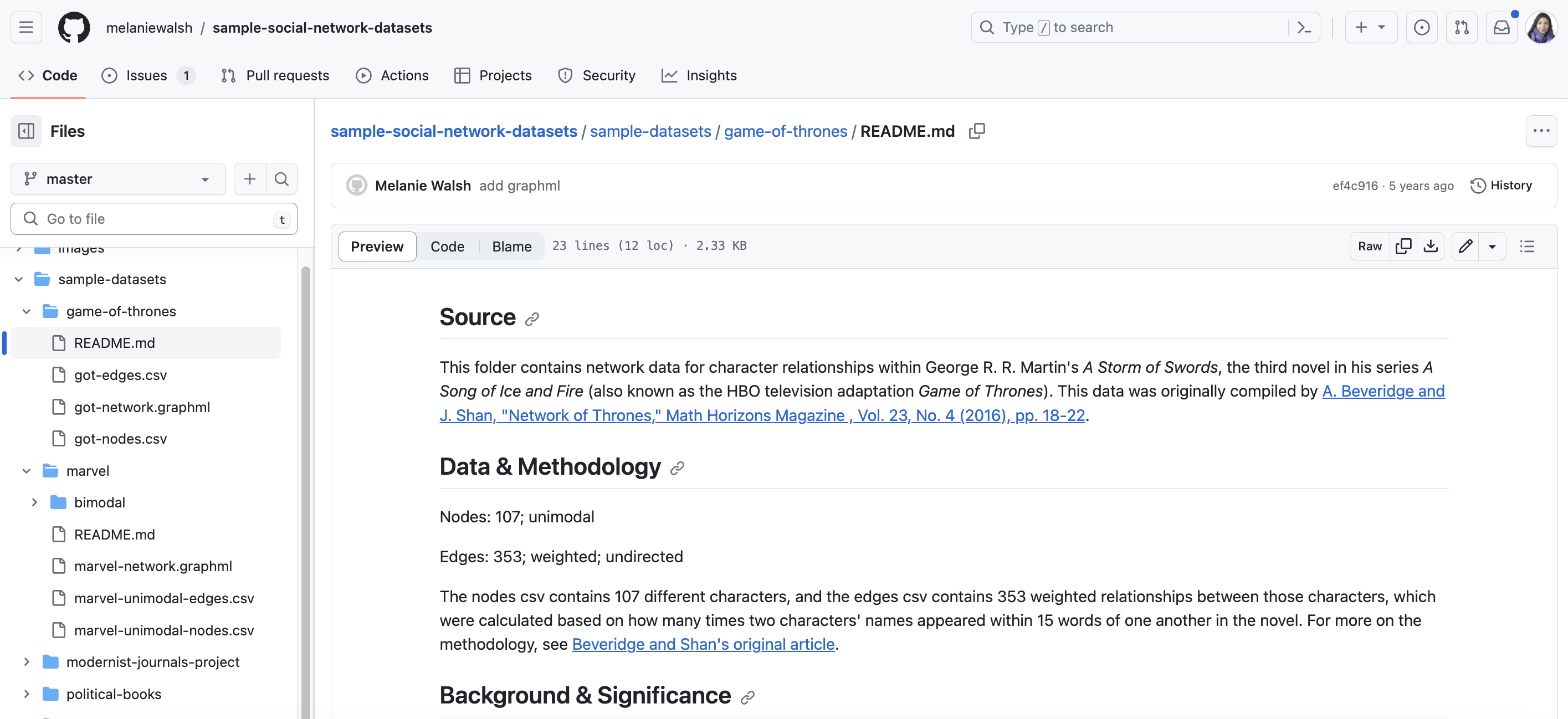
The one I’ve selected is the Game of Thrones network, but you could look at any of these examples. If you click on this image, you’ll see the README for the dataset, detailing the source, data collection methodology, and the background of the dataset and what it represents.
One of the most important pieces of information is the following:
The nodes csv contains 107 different characters, and the edges csv contains 353 weighted relationships between those characters, which were calculated based on how many times two characters’ names appeared within 15 words of one another in the novel. For more on the methodology, see Beveridge and Shan’s original article.
We can learn from this snippet that the data was collected through setting a threshold of how often character names appeared together. This is a common way to create network data from text, but it is important to understand that this is a decision that the researchers made. We could have set a different threshold (like a page or chapter), or only included when characters spoke to each other.
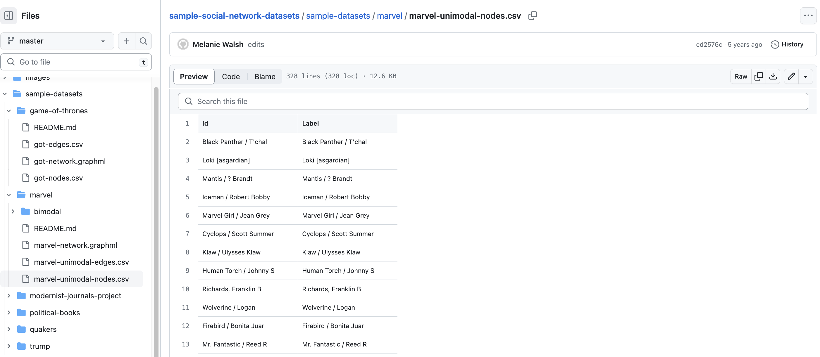
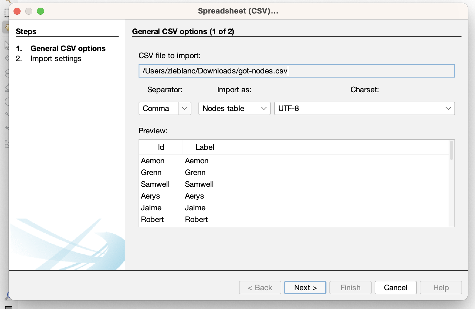
Now if we click on the got_nodes.csv file, we see the following spreadsheet. This is a node list, which is a list of all the entities in our network. In this case, we have a list of all the characters in Game of Thrones. We can see that each character has an Id and a Label. These column names are ones that Gephi in particular requires when entering a nodelist. You could also include other attributes like Gender or House if you wanted to include that information in your network.
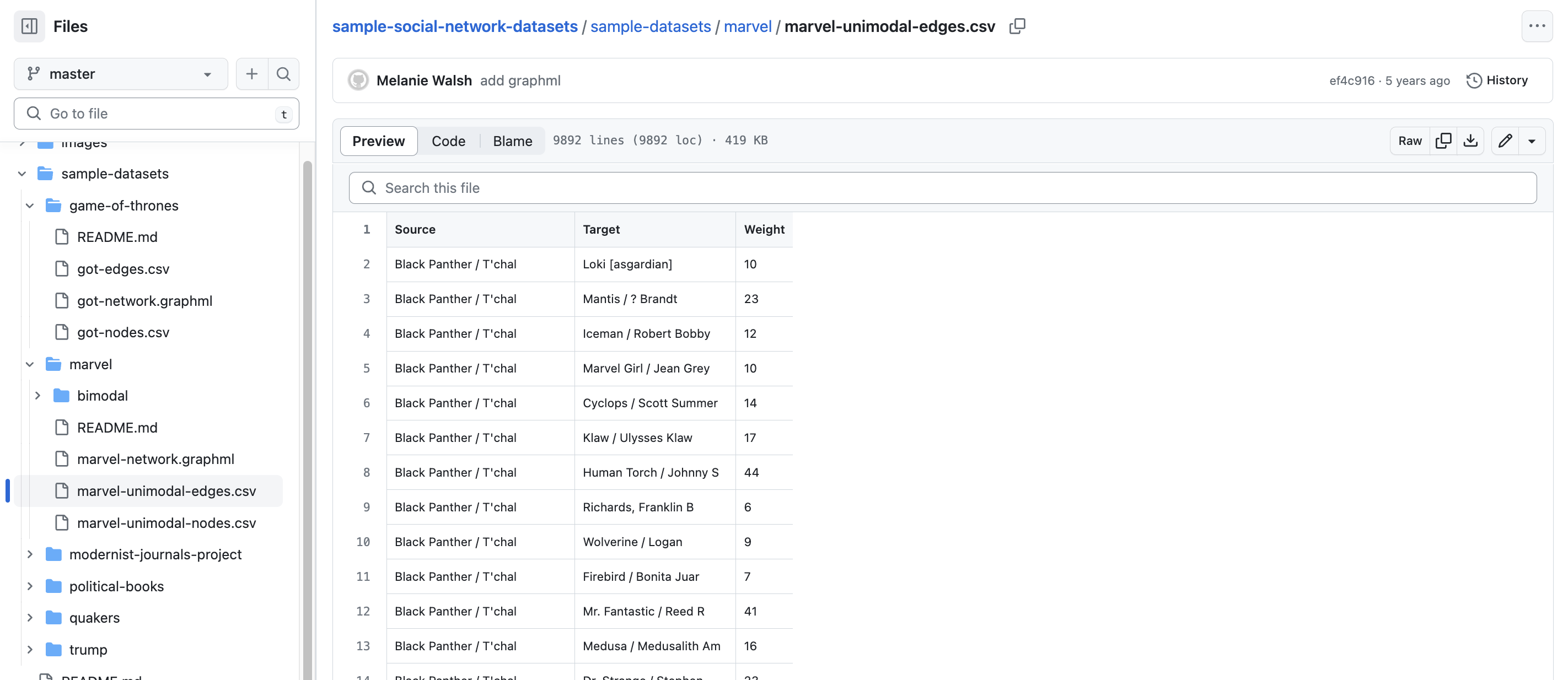
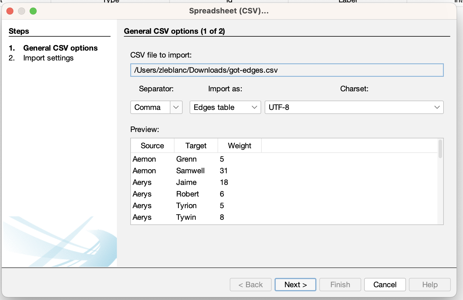
Then if we click on the got_edges.csv, we see that we now have character names but in the columns Source and Target. These columns indicate the edges or relationships in our network. In this case, we also have a weighted network, which means that the number in the Weight column indicates how many times these characters appeared together in the text. Again if we set the threshold differently, this weight number would change significantly.
Now that we are starting to see what network datasets look like, we can start trying to visualize and analyze them.
Visualizing and Analyzing Networks
Networks are incredibly popular in DH for a number of reasons, but especially because of the power of network graphs and metrics.
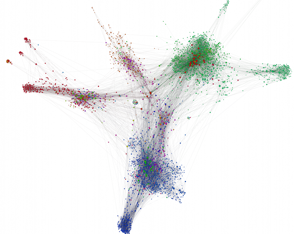
The type of graph above is called a forced-layout atlas graph, but more commonly known as a Hairball graph. These types of visualizations are usually created with a tool called Gephi, though you can create them in all the tools we’ve explored so far.
Let’s try and use the Game of Thrones example to make a network and the popular tool Gephi, which I’ve downloaded previously.
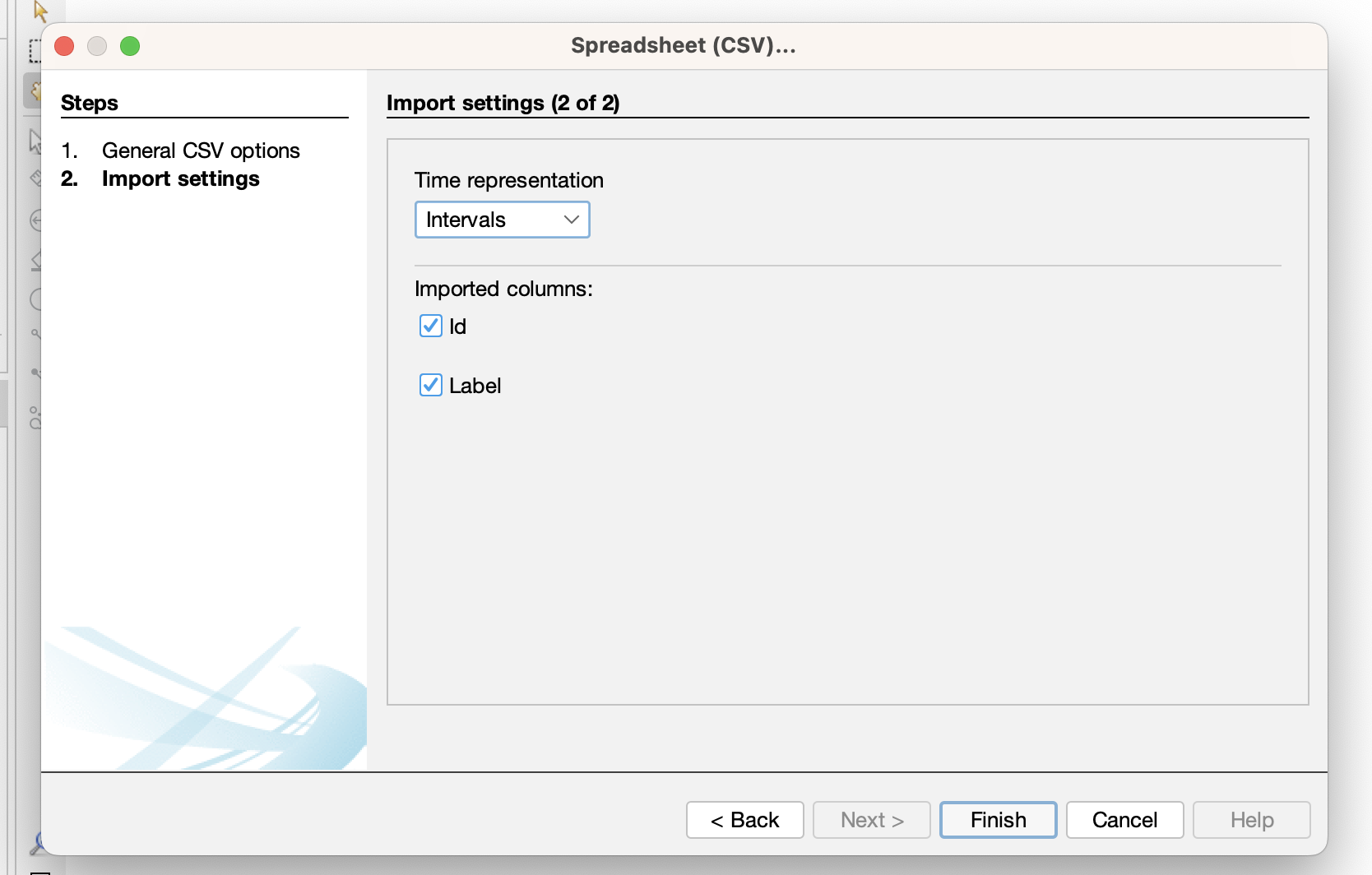
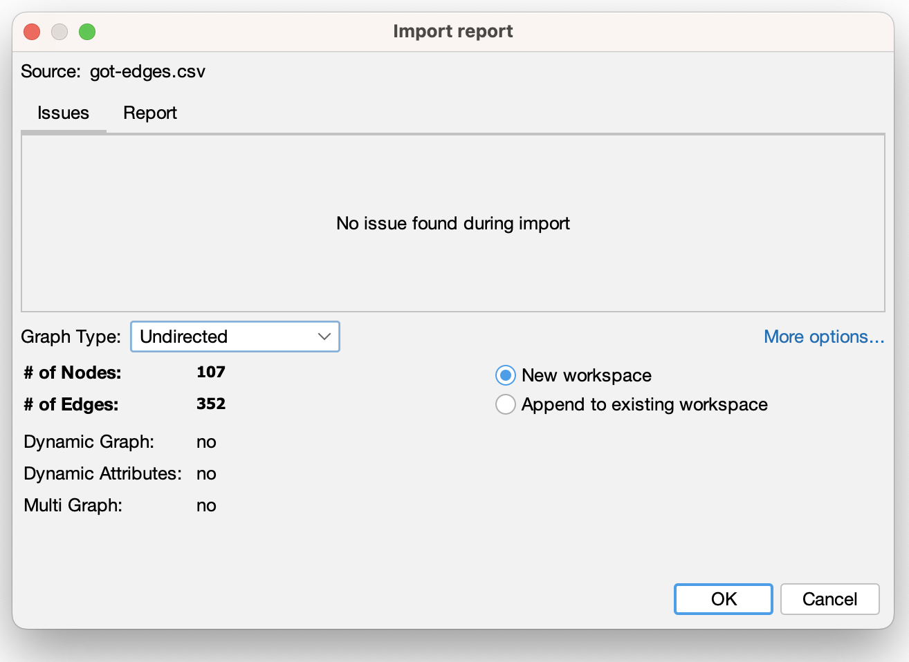
- First, if we are using Gephi we need to create a new project and upload our data:
- Then Gephi will ask us to verify if our columns are correct:
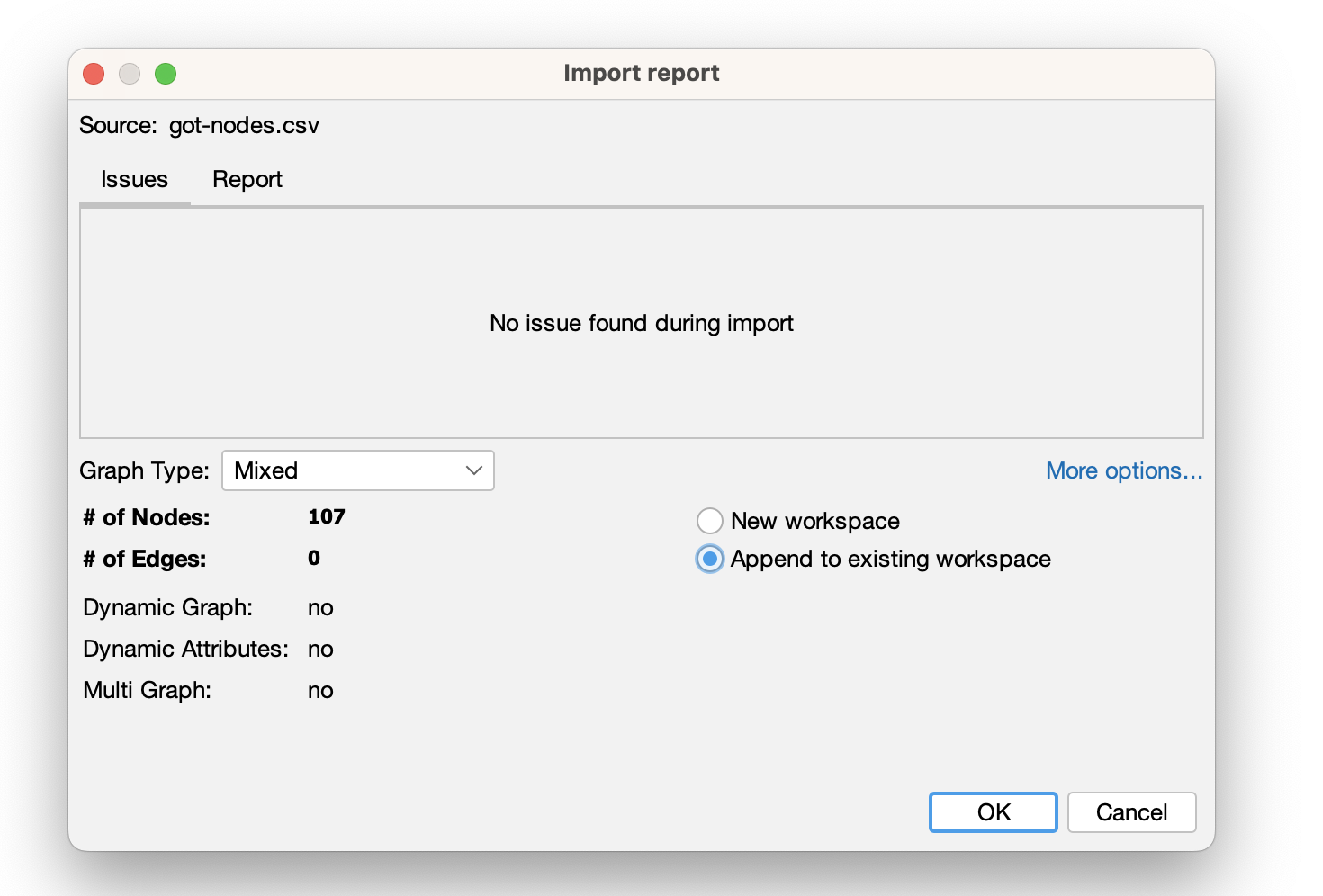
- Then we create our graph:
- We can see that we need to add our edge list still:
- Next we can upload the edges:
- Finally we can finish creating our graph:
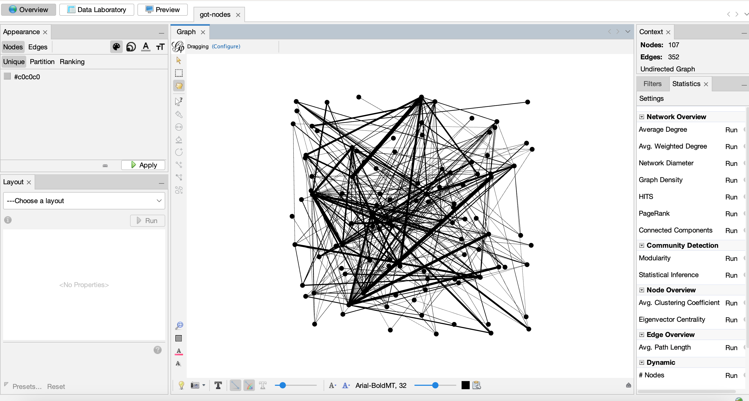
- Here’s our initial graph:
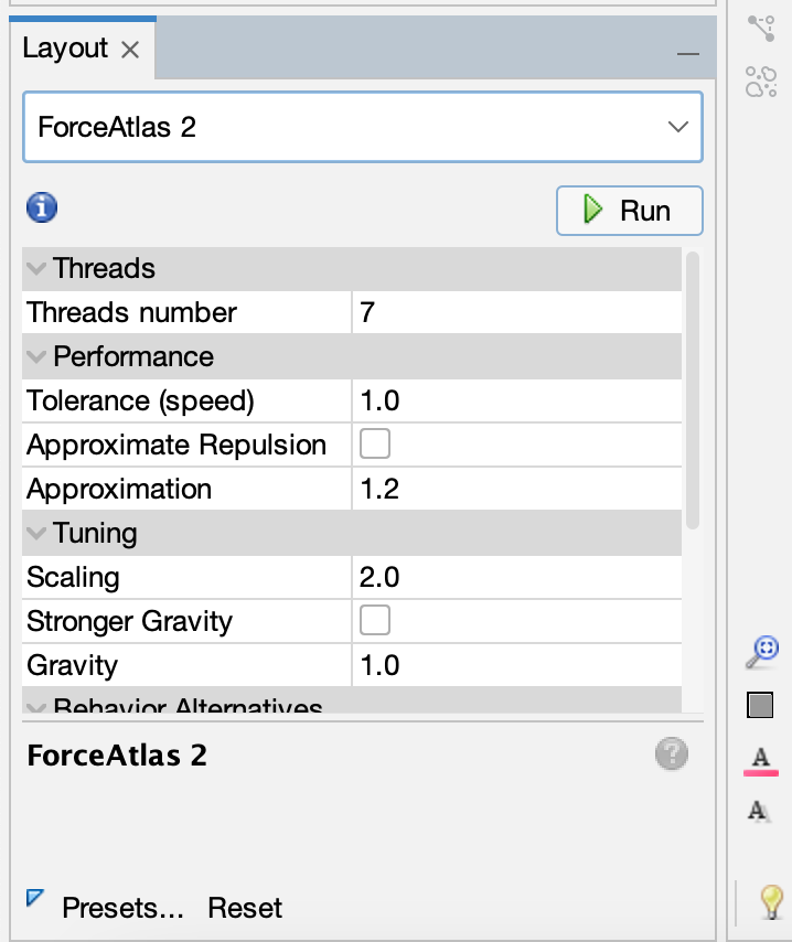
- We can also try to run a layout:
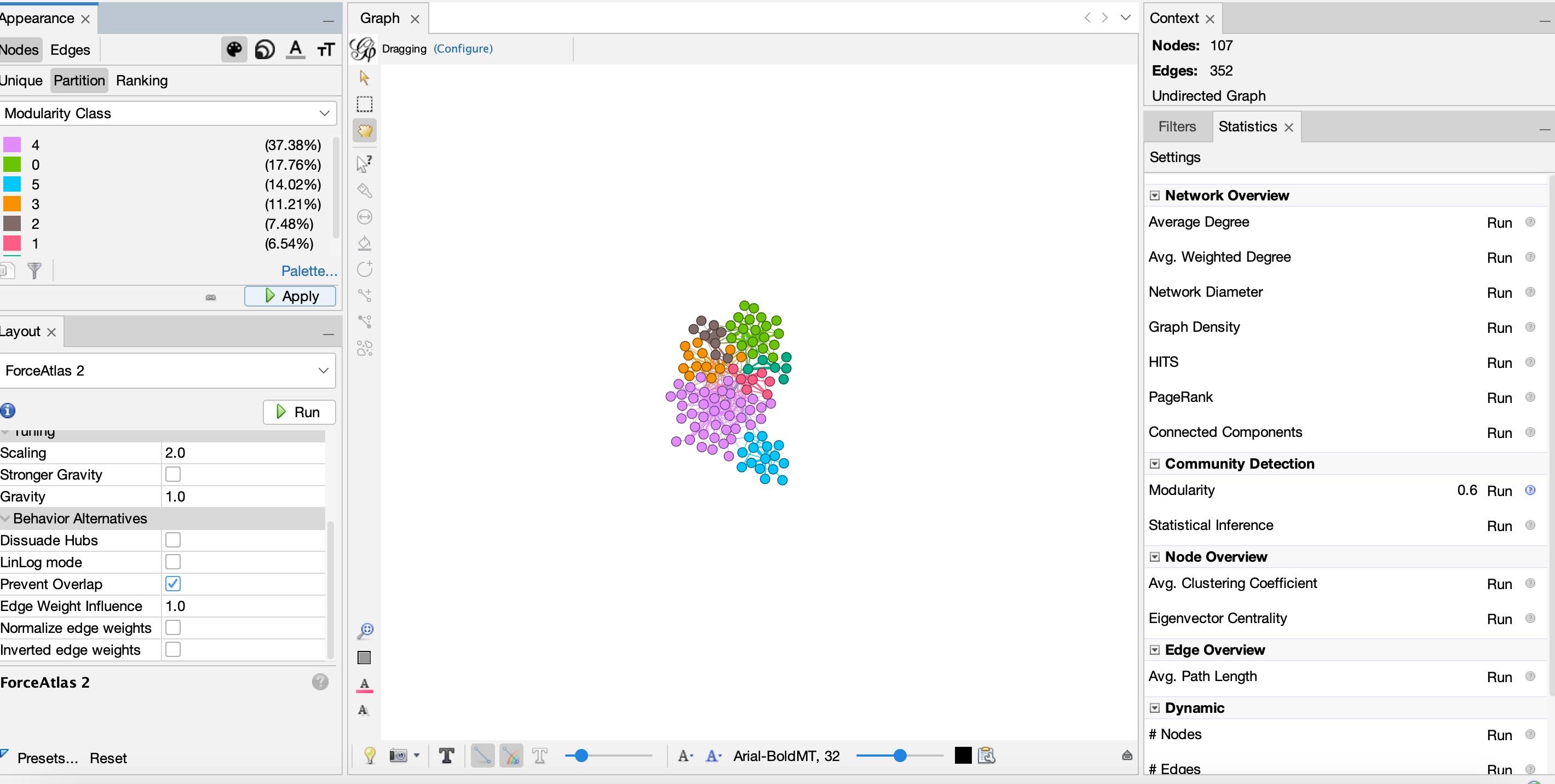
- And then we can try to run some metrics and color our graph:
- We can also add our labels:
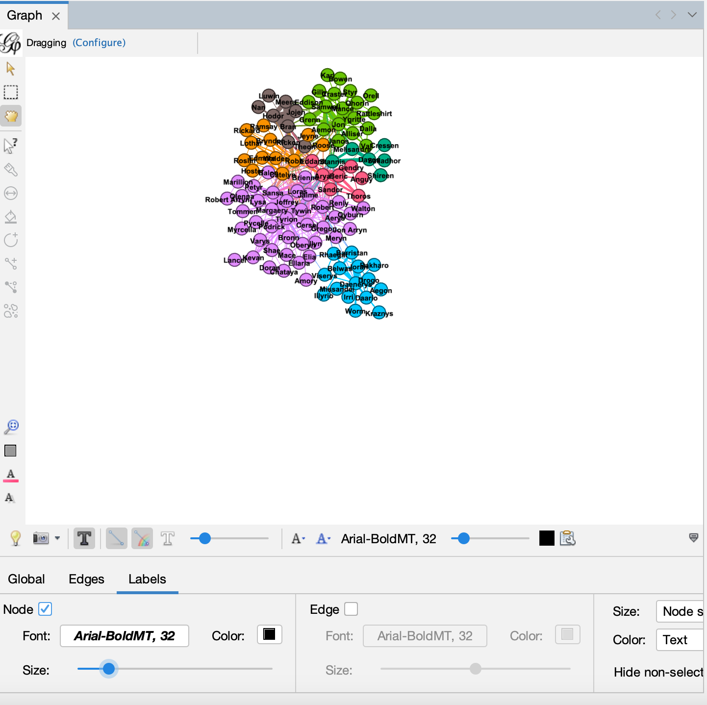
- And then we can try running more metrics and sizing our nodes:
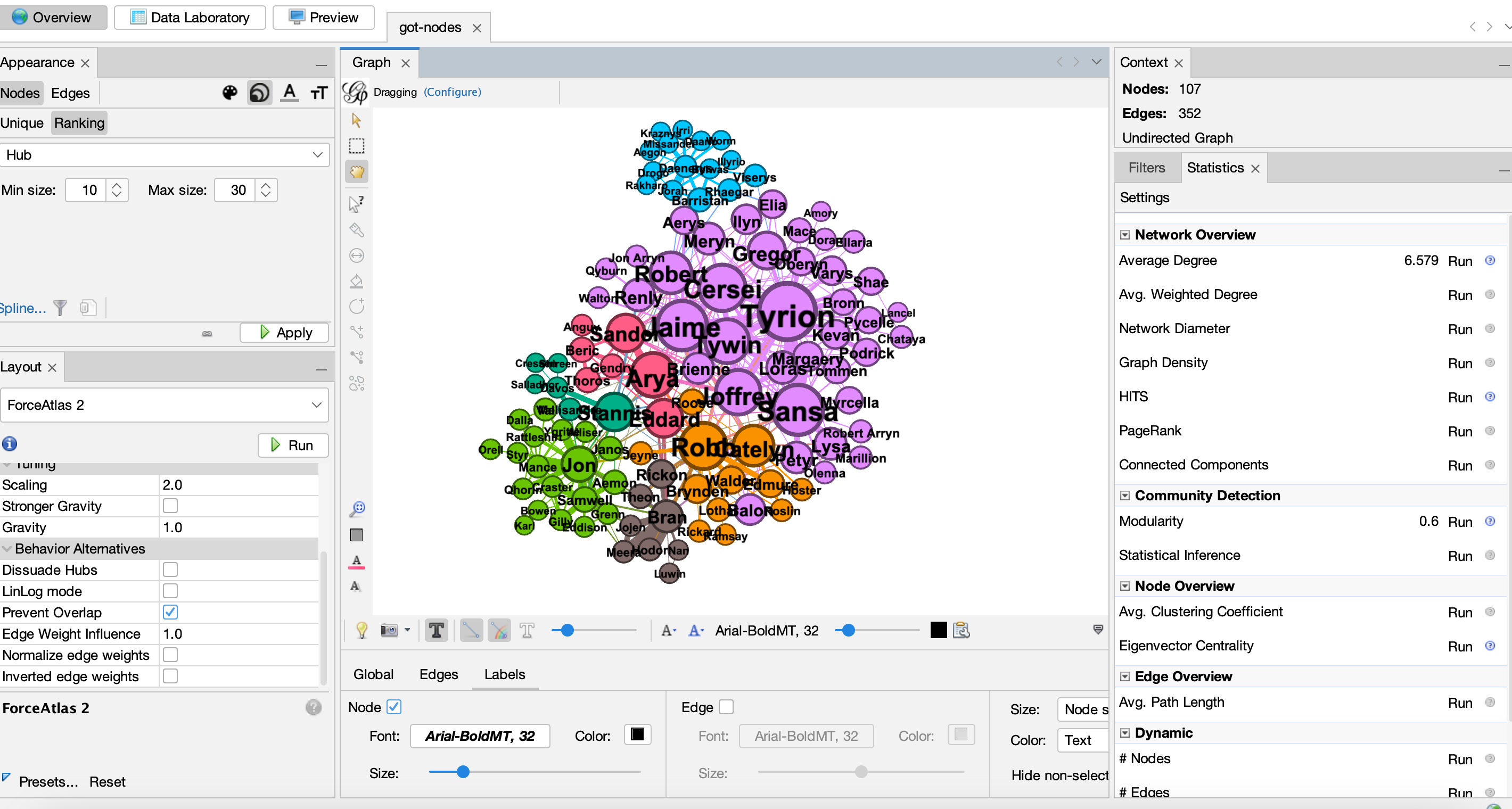
- Or alternative metrics and sizing our nodes:

Network Metrics
The algorithms we have run are all part of network metrics. These metrics are used to calculate different aspects of the network, and can be used to identify important nodes or communities.
- Degree
Degree is one of the most popular network metrics. It represents the number of connections a node has. In the Game of Thrones example, this would be the number of characters that a character interacts with. So nodes that are more central in the network will have a higher degree.
- Betweenness Centrality
Betweenness centrality is also very popular, and it represents the number of times a node acts as a bridge along the shortest path between two other nodes. So nodes that are more central in the network will have a higher betweenness centrality, but this metric is more focused on the connections between nodes. Therefore, nodes with high betweenness centrality are often called brokers or bridges, and they may not have a high degree.
- Modularity or Community
Modularity is a metric that measures the strength of the division of a network into communities. Partioning networks into communities is a very popular approach, and uses the structure of the network to identify groups of nodes that are more connected to each other than to the rest of the network.
Network Analysis Assignment
Your assignment is try out the following tools, using some form of network data:
You might try using a dataset from Melanie Walsh’s repository of sample datasets, or even try to create your work. The core goals are:
- try to upload the data to each of these tools
- try to create some sort of visualization
- try to calculate some network metrics (if that is possible in the tool)
- try to export your visualization and metrics (again if possible for the tool)
While these are all new tools, by now you are all experts on testing out DH tools and reading documentation. But also feel free to reach out to the Instructor or generally on Slack if you have any questions or need help.
Once completed, you should post your visualization and any insights in this forum discussion https://github.com/ZoeLeBlanc/is578-intro-dh/discussions/7.
Resources
- Marten Düring, “From Hermeneutics to Data to Networks: Data Extraction and Network Visualization of Historical Sources,” Programming Historian 4 (2015), https://doi.org/10.46430/phen0044.
- Miriam Posner, Tutorial on building Networks in Flourish https://miriamposner.com/classes/dh201w23/tutorials-guides/network-analysis/flourish-graph/
- Martin Grandjean Tutorial to Gephi https://www.martingrandjean.ch/introduction-to-network-visualization-gephi/